Fausto Pérez – Digital Product Designer
I design digital products, specializing in data visualization and GIS web map interfaces. I strive to create products that show respect for the planet while enriching people’s lives.
I currently work at Development Seed, where I help transform complex geospatial data into actionable insights through user-friendly map interfaces for clients like NASA and Google.
Previously, I was at Cervest, a climate tech startup, and Vizzuality, where I worked on the fascinating worlds of climate change, biodiversity and equality and discovered a love for data visualization and the determination to use my design skills to help people navigate these complex topics.
Earlier in my career I worked as a UX designer at Designit, where I first learned the design craft and the importance of putting real people at the front of every design decision.
All my life, I’ve been lucky to turn my creative passions into realities and have an unusual background in music, both building guitar amplifiers and playing in a band.
Product DesignWorld Resources Institute, Vizzuality, 2017 – 2020
Global Forest Watch: empowering people to protect the world’s forests 🌳
Role: Lead Designer
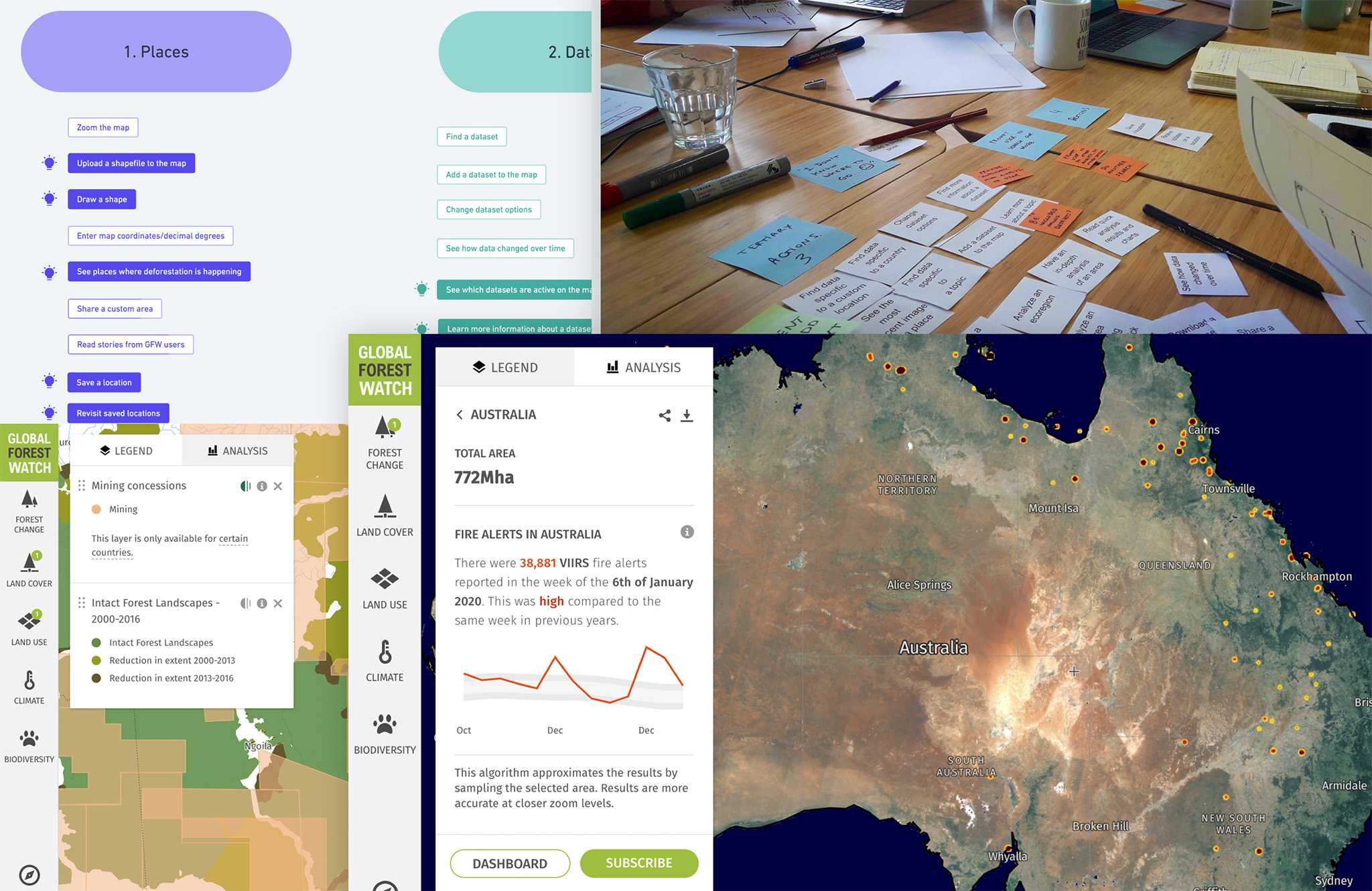
Global Forest Watch is the world–leading web–mapping application to track deforestation everywhere on Earth using satellite data. It is a combination of tools that empower people to better protect forests.
I have a special affection for this project because this is where I honed my skills as a data visualization designer. I was involved in all phases of the design process, including remote user interviews, client communication and ideation workshops, and contributed solutions to critical sections of the web app, such as the interactive map and the country dashboards.
Case study: analyzing the Siberian 2020 wildfires
During my time in the project, I led the design of a sharper set of tools to monitor fires as they happen. I did this work with an amazing team of scientists, user researchers, and developers —plus the awesome people at the World Resources Institute—, making good use of new visualization capabilities and platform performance improvements that allowed people to view, analyze —and animate— more data in one go.
Let’s take a look at one specific example. If you remember, during the summer of 2020, Siberia experienced a massive outbreak of wildfires, including fires on tundra underpinned by permafrost, which raised alarms in the scientific community.
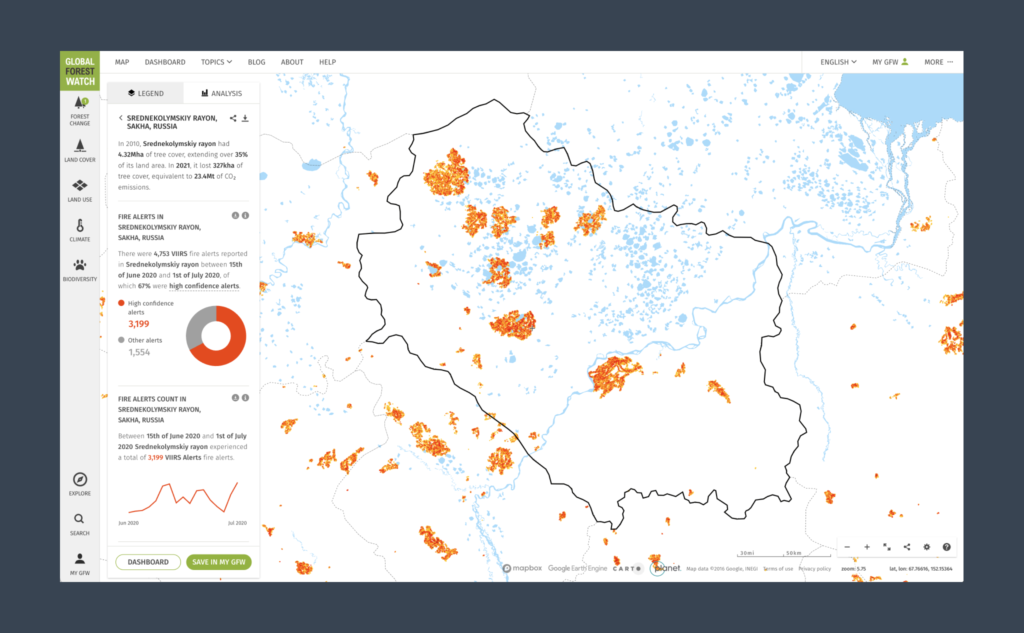
Using the dashboards to identify the exact location where fires occurred
Siberia is a BIG place, so let’s use the Russia dashboards to guide us to some areas of interest.
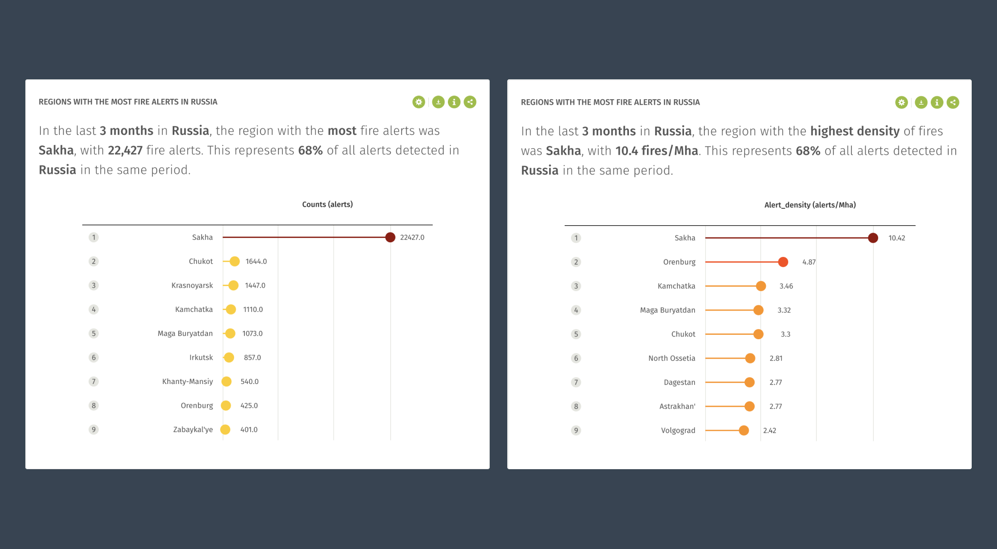
Checking out the region rankings for Russia, the district of Sakha stands out. We can see that Sakha ranks first in terms of the total number of fires and the fire density.
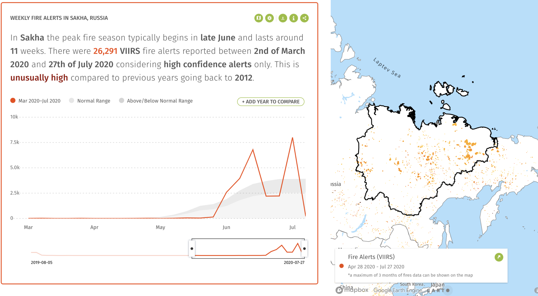
Taking a closer look, we see the first big spike of fire alerts towards the end of June 2020:
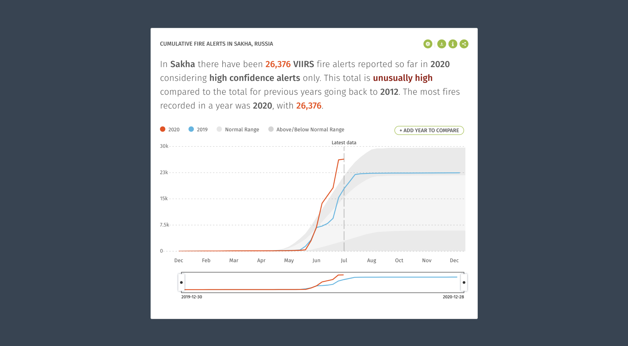
The cumulative fires widget confirms that this is the worst year the region has experienced fires… since the previous year:
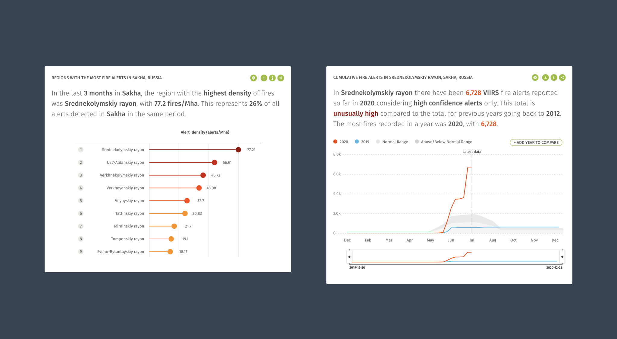
Let’s go deeper and see where fires are the most intense. Let’s now check the ranking for locations within the Sakha region. The Srednekolymskiy district has the most intense fires (left), and, again, the cumulative fire alerts widget confirms it (right):
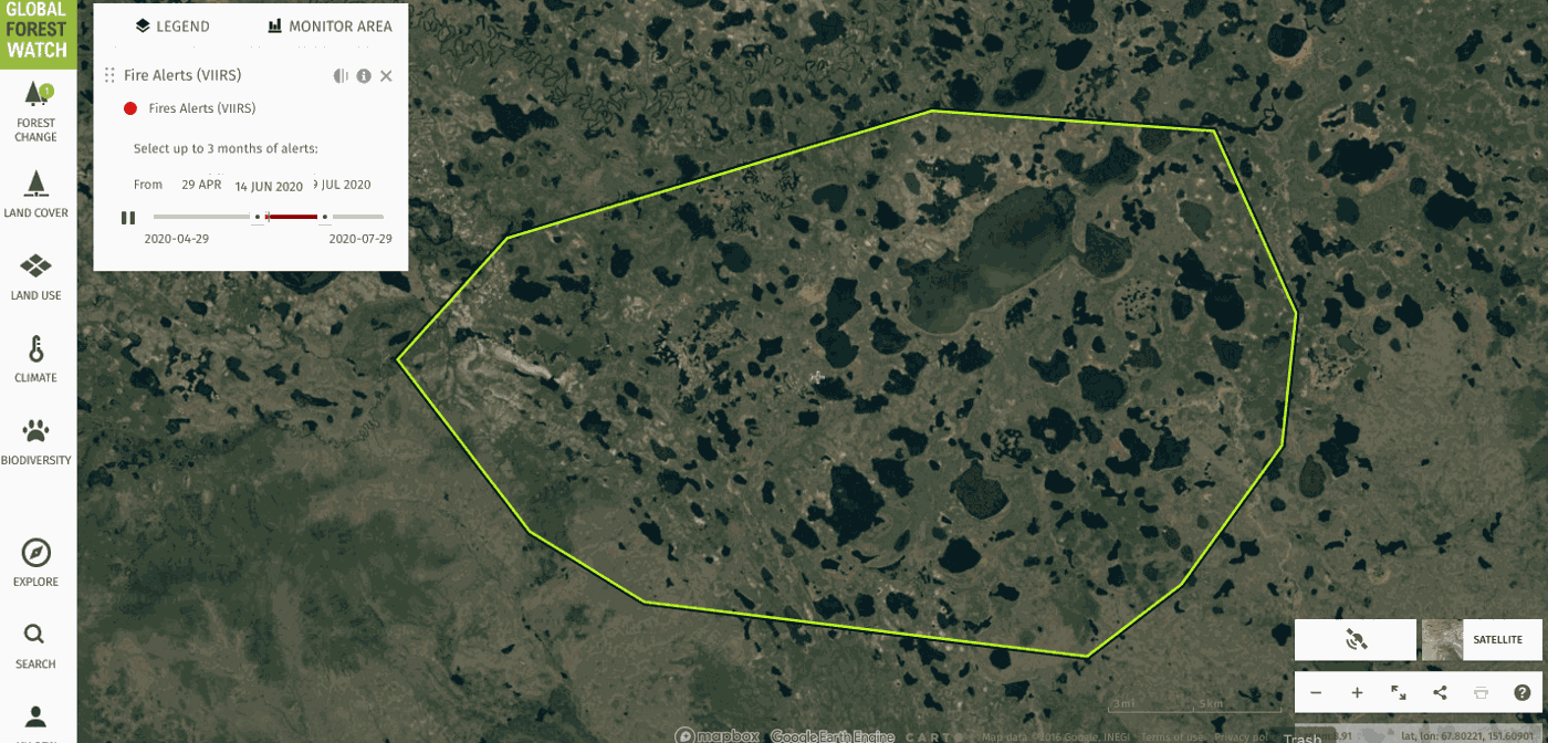
Analyzing the fires data layer on the map
Let’s now jump to the map and see if we can use some of the other tools offered by Global Forest Watch to gather further details. A quick search gets us back to the Srednekolymskiy district, our area of interest. Note that the application instantly loads contextual information about the region and some useful analysis when the Fire alerts layer is active:
Again, we can see those vast (~1000 square kilometers) hotspots. Shall we check one of them out? We know when the spike occurs (~mid-June) so let’s zoom in and animate it. Hit play on the layer panel and watch the rapidly spreading fires.
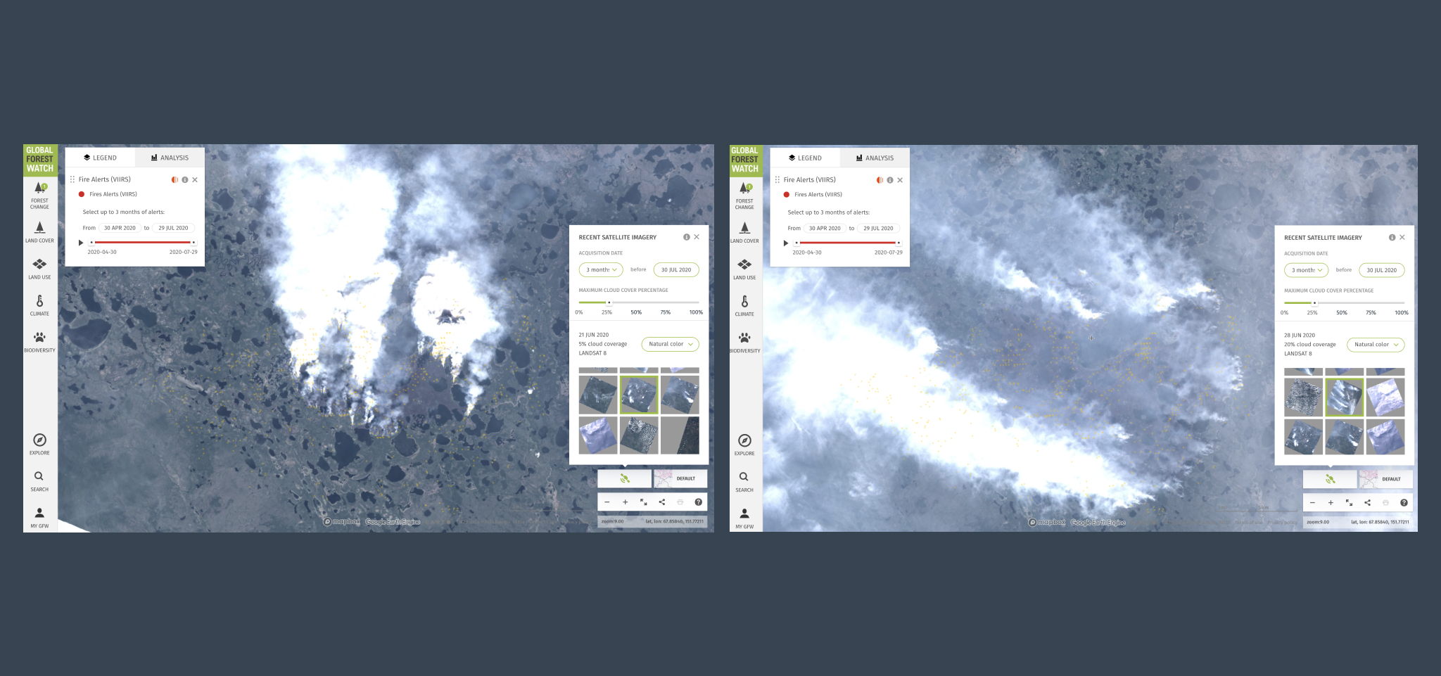
Confirming the data using satellite imagery
Let’s do one last thing: confirm that actual fires were happening at that time so let’s activate the Recent Satellite service and access Sentinel-2 and Landsat-8 images of the location. Visual proof beats fake news, right?
Early fires on 21 June 2020 (left) spreading outwards by 28 June 2020 (right):
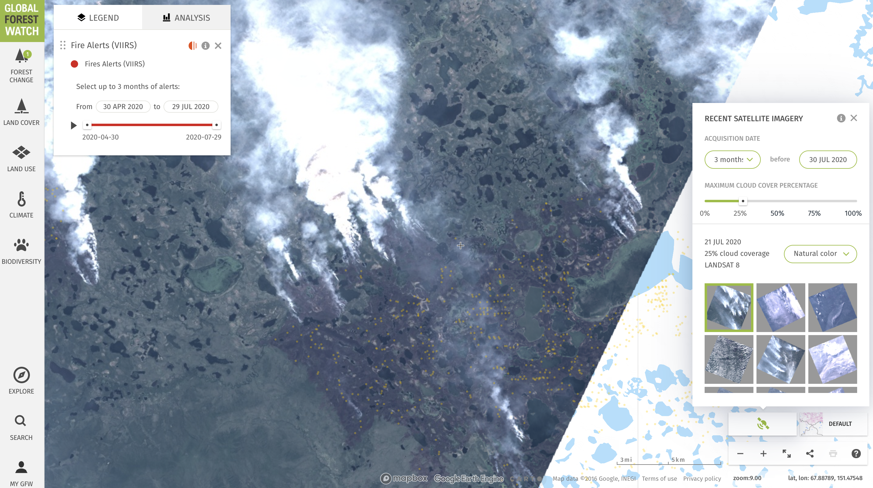
More wildfire satellite images, these are from 21 July 2020. Note the burn scar from previous wildfires:
Product Design Cervest, 2021 – 2022
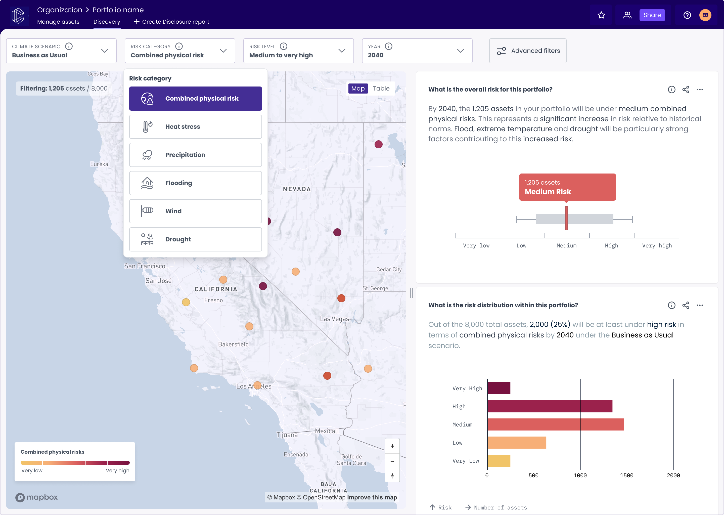
Democratizing climate risk assessment: defining the product at a hypergrowth startup 🚀
Role: Senior Product Designer
I led the product innovation design team at Cervest’s EarthLab. EarthLab served a zero-to-one function within Cervest, that focused on the R&D of strategic innovations.
I was also involved in Cervest’s funding rounds, leading the design of product prototypes that showcased upcoming use-cases and advanced future product capabilities that played a vital role in the conversations with investors, resulting in a successful $30 million Series A funding round.
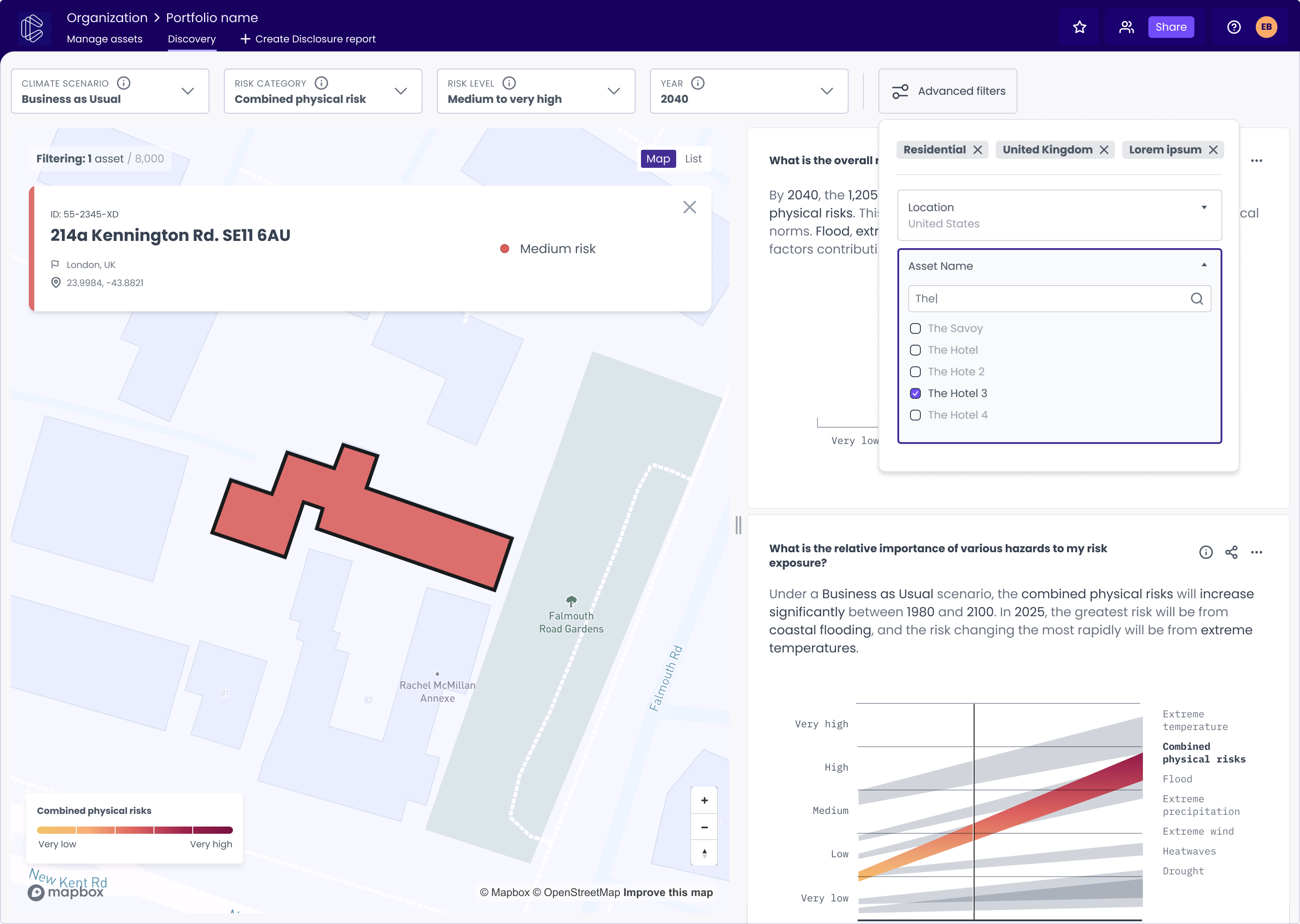
In my first months at Cervest I was part of the Product team where I contributed my expertise in interaction design, GIS, and data visualization projects that helped the team build —in record time— a clean and easy-to-use MVP that set the EarthScan product foundations.
Design coordinationE.O. Wilson Biodiversity Foundation, Vizzuality, 2019
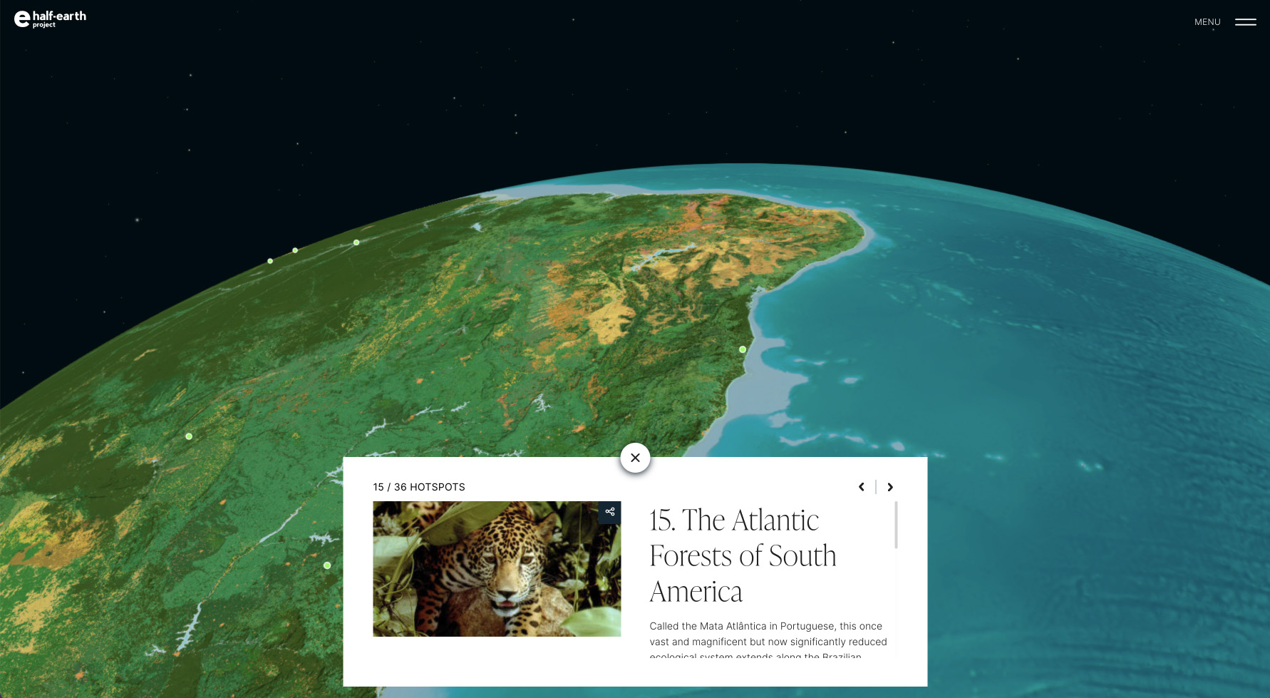
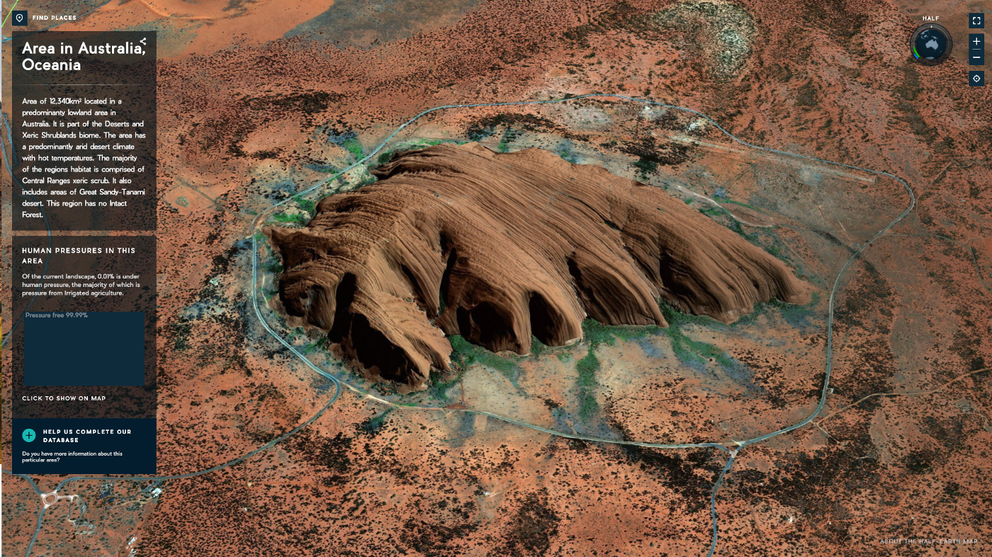
The Half-Earth map: conveying the idea of an evocative, beautiful planet worth protecting 🌍
Role: Lead designer, Design coordination
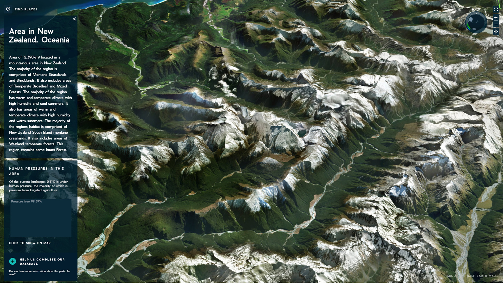
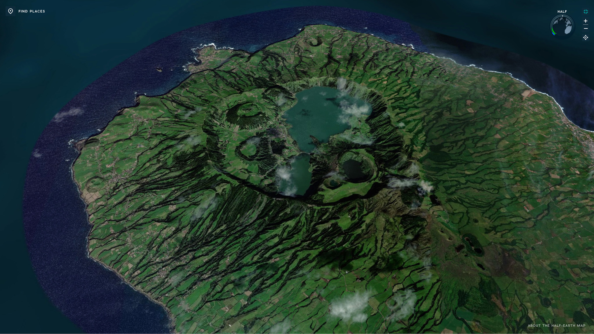
Conceived by E.O. Wilson, Half-Earth is a call to conserve half the Earth’s land and sea to manage sufficient habitat to safeguard the bulk of biodiversity.
On this project, we worked with the E.O. Wilson Biodiversity Foundation, Map of Life, and Esri to construct an interactive globe depicting the diversity of life on Earth and answer E.O. Wilson’s call to action to commit half of the planet’s surface to nature.
As well as contributing to the design of the interactive platform, I had the privilege of coordinating the work of two of my favorite designers, the multitalented Estefanía Casal and Esri’s own mapgician John Nelson, who created the most fantastic experience of fun and collaborative cartography: the Half-Earth vibrant map.
To celebrate the outcome of our work, the Half-Earth map was then added to Esri's catalog of basemaps to be enjoyed by happy designers and geographers in the future.
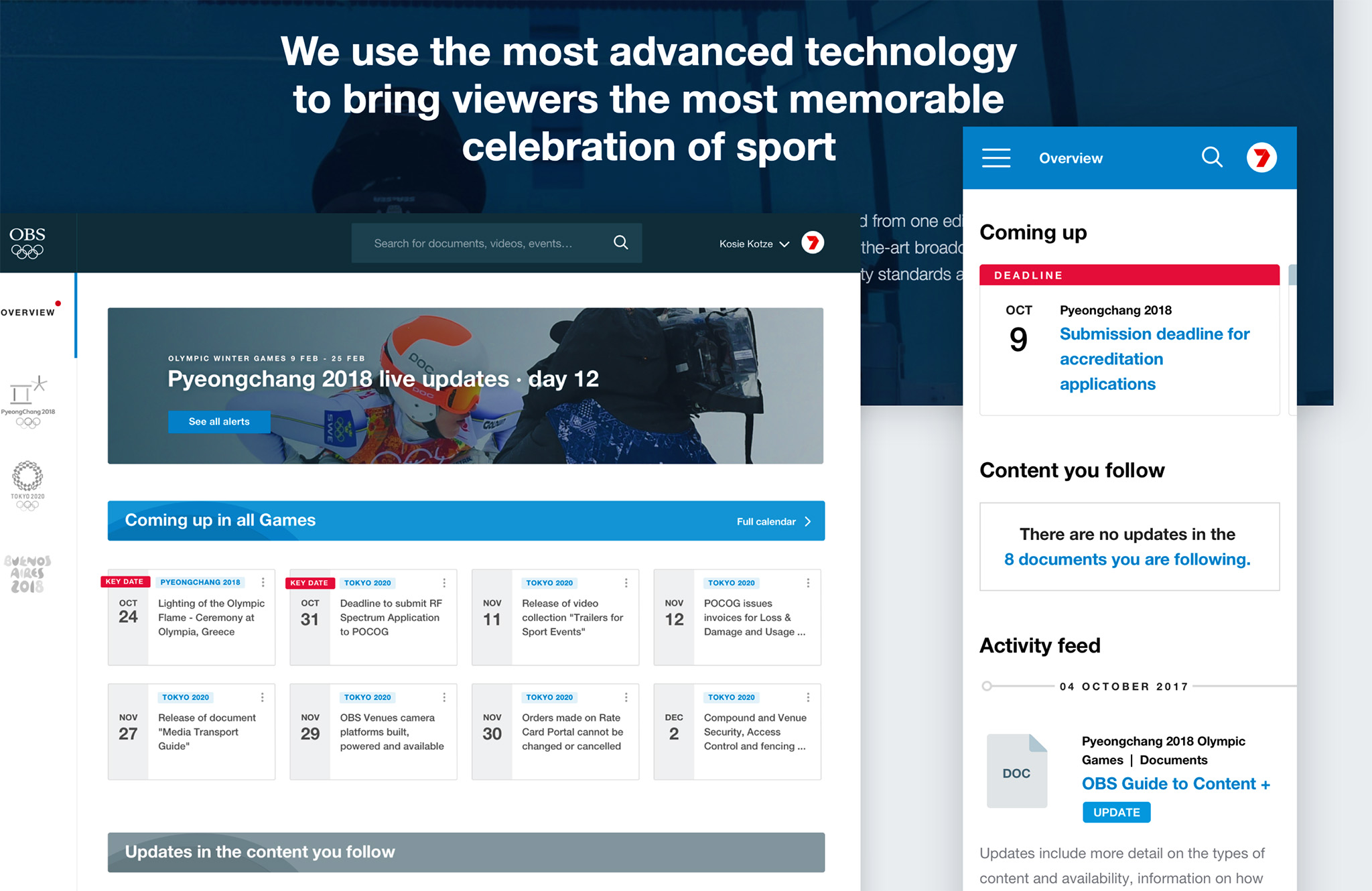
Product DesignOlympic Broadcasting Services, Designit, 2017
Designing an optimal experience for Olympic and Paralympic Games broadcasters 🤸
Role: Lead designer, Project coordination
Olympic Broadcasting Services (OBS) is the host broadcast organization for the Olympic and Paralympic Games. TV networks worldwide rely on their information throughout the preparations and during each Olympic and Paralympic Games.
On this project, we completely redesigned the broadcaster user experience to make it easier to view, search, edit, organize and re-use media files such as documents, venues and stadiums plans, technical manuals, photos, broadcast-quality videos, etc.
I was also responsible for project managing tasks and communicating with the client.
We conducted several internal OBS and broadcaster interviews to understand their needs and expectations better. We analyzed the content of their existing website and performed desk research to identify further opportunities. Then we held a workshop with the client to share the analysis and insights from the Research phase, co-create the variables and share the principles to guide the new design.
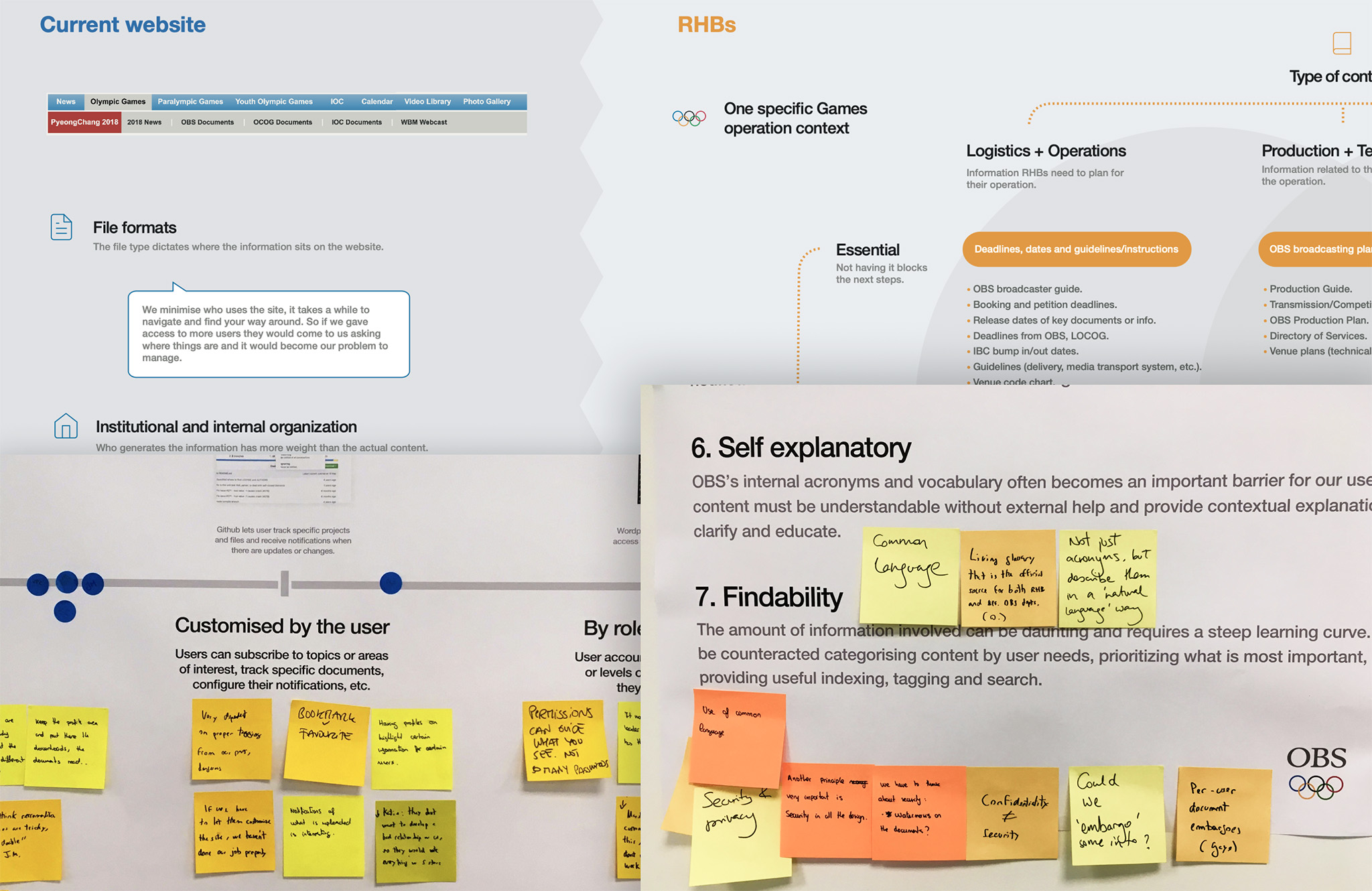
We then distilled the shared vision we had co-created with the client into simple, easy-to-understand concepts and reusable design patterns. We generated the main screens for all the different resolutions and the related documentation to help convey our design decisions to the client. We communicated the interaction details using low-fidelity prototypes.
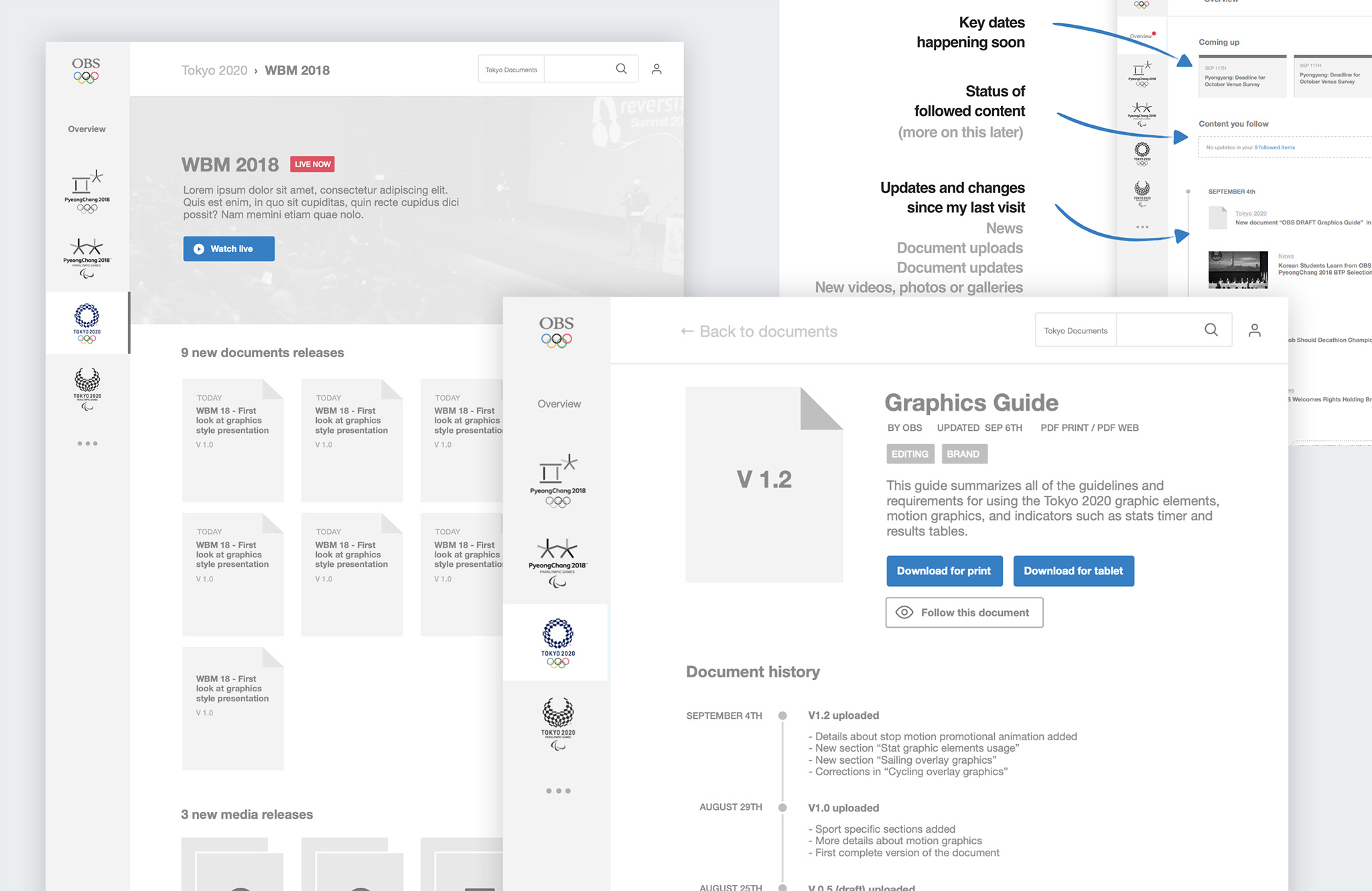
In the visual phase, we applied the Olympic brand and colors to all key screens for both desktop and mobile. We created the products’s design system, low and high fidelity prototypes and support guidelines and files for developers. We did this for both the private site (only accessed by TV professionals) and the public site, aimed at the general public.
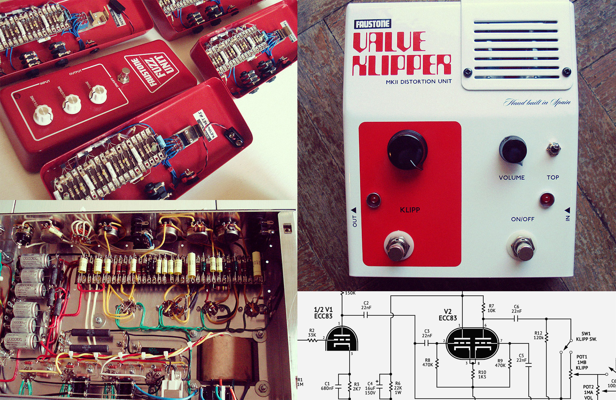
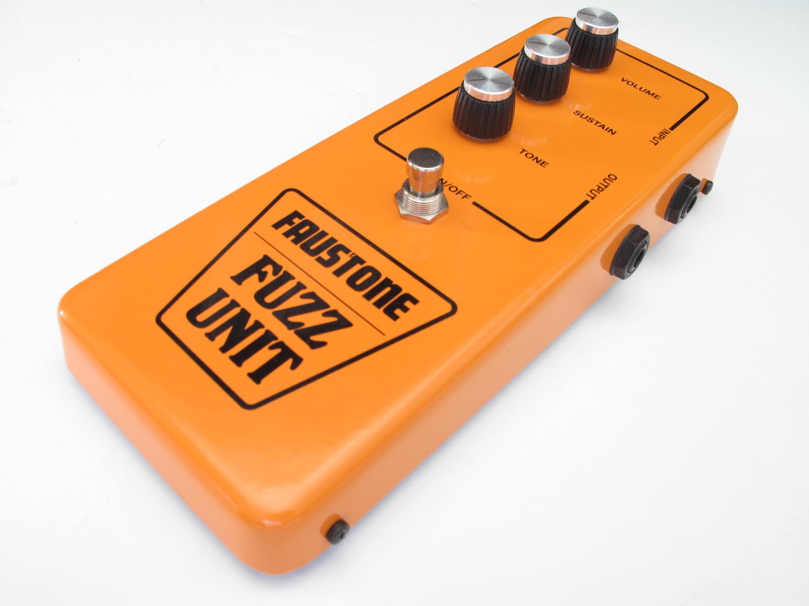
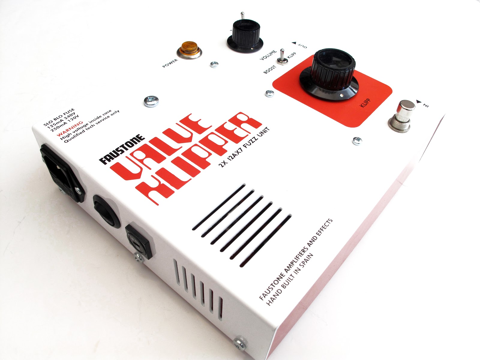
Side projectFaustone, 2006 – 2012
A passion for music: building tube guitar amplifiers and pedals 🎸
Role: Everything!
During my music years, I started a guitar amplifier business. It felt good to build and deliver actual products you could touch, smell and play with. I learned a lot about product design, industrial design, running my own business, and dealing with providers, distributors, and end-users.
When I no longer had the time to build these boxes, I open-sourced the schematics for anyone to try their own.
A while ago, I made a website about it you can still visit at faustone.com.